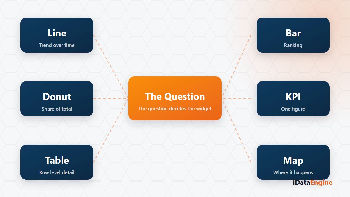
When a new dashboard request arrives, the first move is usually to open the chart list. Bar, line, donut? There is a question that has to be answered before that list: what decision will the user make after looking at this screen?
Skip it and the result is familiar. A page with twelve visuals that everybody praises and nobody opens. The cost is invisible too. It is not the design effort; it is that the person who was supposed to decide something there still keeps their own spreadsheet.
Matching a question to a widget type
- A single value. Today’s revenue, the number of open orders: KPI and card components are enough. Putting a chart next to them splits attention.
- A trend over time. Line and area charts work here, and date hierarchies let year, quarter and month be explored inside the same visual.
- A comparison across categories. Bar charts; when category names are long, the horizontal version stays readable.
- The stages of a process. A funnel fits, a waterfall suits contribution analysis, and a scatter plot the relationship between two variables.
- A geographic breakdown. Turkey and world map components are available, alongside treemap and gauge among the defined widget types.
These are strong for the right question and decoration for the wrong one. On a management page, decoration means a screen that does not get read.
Where the advanced grid differs from a plain table
If the user will drill into rows there are two options: the standard table or the advanced analytical grid. The advanced grid offers server-side paging and exact record counts, and the difference shows up on large data sets.
Conditional formatting, data bars, icon sets and value mapping turn a table from a pile of numbers into a summary someone can read. Grid data can be exported to Excel as a stream, and that export covers flat data: pivot export is not supported. If a user plans to pivot the result themselves, that boundary is worth knowing up front.
Testing a calculated measure before it ships
IDL-based calculated measures can be validated and previewed before they are saved. Trying a formula before it lands on a page is what keeps a wrongly calculated ratio out of a management meeting. It is the least visible and most useful step in the whole design.
Field drop zones, measures, sorting, series breakdown, small multiples and dual axes decide how readable the same visual is. Desktop and mobile layouts are designed separately, so if anyone will open the page on a phone, that layout needs its own review.
And you cannot confirm a widget behaves correctly from your own account. Filter and authorization scope have to be tried with different roles, to check that the visual still answers the same question for the people who will actually use it.
More charts do not mean better analysis; two well-chosen visuals get opened far more often than eight. So before your next dashboard request reaches the chart list, write one sentence: what decision will the person looking at this screen make? Send us that sentence and we will work out together which widget type actually answers it.